
Layout Links
Customise the shared navigation links on all layouts.
Overview
Fumadocs allows adding additional links to your layouts with a links prop, like linking to your "showcase" page.
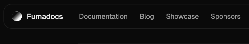
You can see all supported items below:
Link Item
A link to navigate to a URL/href, can be external.
import { BookIcon } from 'lucide-react';
import type { BaseLayoutProps } from 'fumadocs-ui/layouts/shared';

export function baseOptions(): BaseLayoutProps {
  return {
    links: [
      {
        icon: <BookIcon />,
        text: 'Blog',
        url: '/blog',
        // secondary items will be displayed differently on navbar
        secondary: false,
      },
    ],
  };
}
Active Mode
The conditions to be marked as active.
| Mode | Description |
|---|---|
url | When browsing the specified url |
nested-url | When browsing the url and its child pages like /blog/post |
none | Never be active |
import type { BaseLayoutProps } from 'fumadocs-ui/layouts/shared';
export function baseOptions(): BaseLayoutProps {
return {
links: [
{
text: 'Blog',
url: '/blog',
active: 'nested-url',
},
],
};
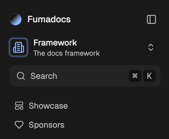
}Icon Item
Same as link item, but is shown as an icon button. Icon items are secondary by default.
import { BookIcon } from 'lucide-react';
import type { BaseLayoutProps } from 'fumadocs-ui/layouts/shared';

export function baseOptions(): BaseLayoutProps {
  return {
    links: [
      {
        type: 'icon',
        label: 'Visit Blog', // `aria-label`
        icon: <BookIcon />,
        text: 'Blog',
        url: '/blog',
      },
    ],
  };
}
Custom Item
Display a custom component.
import type { BaseLayoutProps } from 'fumadocs-ui/layouts/shared';

export function baseOptions(): BaseLayoutProps {
  return {
    links: [
      {
        type: 'custom',
        children: <Button variant="primary">Login</Button>,
        secondary: true,
      },
    ],
  };
}
GitHub URL
There's also a shortcut for adding GitHub repository link item.
import type { BaseLayoutProps } from 'fumadocs-ui/layouts/shared';
export function (): BaseLayoutProps {
return {
: 'https://github.com',
};
}Normal Menu
A menu containing multiple link items.
import type { BaseLayoutProps } from 'fumadocs-ui/layouts/shared';
export function baseOptions(): BaseLayoutProps {
return {
links: [
{
type: 'menu',
text: 'Guide',
items: [
{
text: 'Getting Started',
description: 'Learn to use Fumadocs',
url: '/docs',
},
],
},
],
};
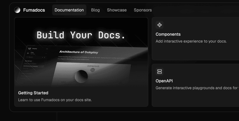
}Navigation Menu
In Home Layout, you can add navigation menu (fully animated) to the navbar.
import { baseOptions } from '@/lib/layout.shared';
import type { ReactNode } from 'react';
import { HomeLayout } from 'fumadocs-ui/layouts/home';
import {
  NavbarMenu,
  NavbarMenuContent,
  NavbarMenuLink,
  NavbarMenuTrigger,
} from 'fumadocs-ui/layouts/home/navbar';

export default function Layout({ children }: { children: ReactNode }) {
  return (
    <HomeLayout
      {...baseOptions()}
      links={[
        {
          type: 'custom',
          // only displayed on navbar, not mobile menu
          on: 'nav',
          children: (
            <NavbarMenu>
              <NavbarMenuTrigger>Documentation</NavbarMenuTrigger>
              <NavbarMenuContent>
                <NavbarMenuLink href="/docs">Hello World</NavbarMenuLink>
              </NavbarMenuContent>
            </NavbarMenu>
          ),
        },
        // other items
      ]}
    >
      {children}
    </HomeLayout>
  );
}
How is this guide?
Last updated on